How to Interpret Box Plots: Video Lesson
How to Compare Box Plots: Video Lesson
A box plot is a diagram used to display the distribution of data. A box plot indicates the position of the minimum, maximum and median values along with the position of the lower and upper quartiles. From this, the range, interquartile range and skewness of the data can be observed. Box plots are a useful way to compare two or more sets of data visually.
In statistics, a box plot is used to provide a visual summary of data. The distribution of data is shown through the positions of the median and the quartiles. From this, the spread and skew of the data can also be seen. Side-by-side box plots allow for two or more data sets to be compared in a graphical form.
How to Read a Box Plot
To read a box plot:
- Read the minimum value in line with the first line.
- Read the maximum value in line with the last line.
- Read the lower quartile which is in line with the start of the box.
- Read the upper quartile which is in line with the end of the box.
- Read the median which is in line with the line inside the box.
A box plot is also known as a box and whisker plot. The minimum and maximum are located at the ‘whiskers’ of the plot. The lower and upper quartiles are located at the upper and lower edges of the box portion of the plot. The median is found at the position of the line inside the box.


How to Analyze a Box Plot
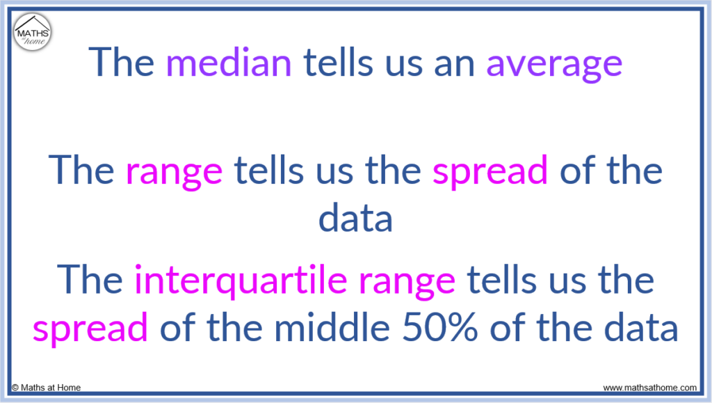
- The median is an average. The larger median, the larger the average.
- The range = maximum – minimum. The larger the range, the more spread the data is.
- The IQR = Q3 – Q1. The larger the interquartile range, the more spread the middle 50% of the data is.
The spread of data refers to how spread out the numbers in the data are. Both the range and interquartile range are used to describe the spread of data.
The larger the range, the more spread the whole data is.
The larger the interquartile range, the more spread the middle 50% of data is.
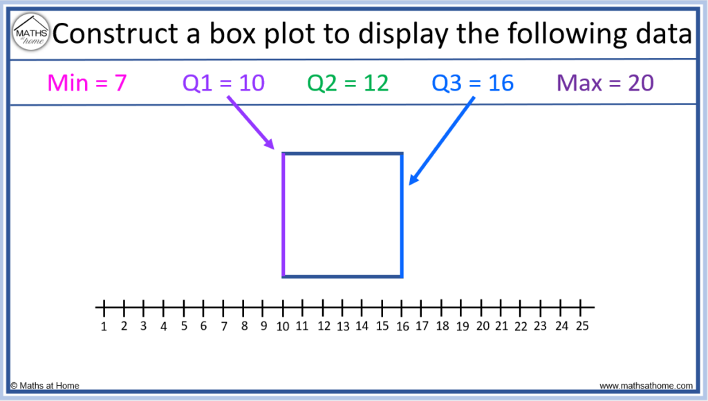
How to Construct a Box Plot
To construct a box plot:
- Draw lines to indicate the position of the lower and upper quartiles.
- Connect these lines to make a box.
- Draw a line inside the box to indicate the position of the median.
- Draw lines to indicate the position of the minimum and maximum and connect these lines to the box.
For example, construct a box plot for the following data:
Minimum = 7. Lower Quartile (Q1) = 10. Median (Q2) = 12. Upper Quartile (Q3) = 16. Maximum = 20.
Step 1. Draw lines to indicate the position of the lower and upper quartiles
We draw lines in line with the values at Q1 and Q3. Here this is at Q1 = 10 and Q3 = 16.


Step 2. Connect these lines to make a box
Step 3. Draw a line inside the box to indicate the position of the median
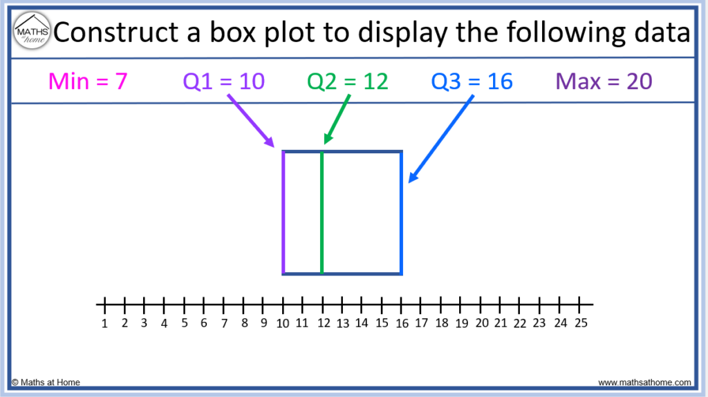
So far, the lower quartile (Q1), the upper quartile (Q2) and the median have been constructed, forming the box portion of the box plot.
Step 4. Draw lines to indicate the position of the maximum and minimum and connect these lines to the box

The position of the minimum and maximum are shown with lines, called whiskers. These whiskers are connected to the box portion of the box plot.
How to Construct a Box Plot from a List of Data
To construct a box plot from a list of data, first calculate the first, second and third quartiles. These quartiles are found at the (n+1)/4, (n+1)/2 and 3(n+1)/4 positions, where n is the number of data points in an ordered list. Plot these quartiles along with the minimum and maximum points using lines and connect them to make a box.
For example, construct a box plot from the data in the list 1, 3, 5, 6, 6, 7, 9. There are 7 numbers in the list, so n = 7.
- Q1 is found at position (n+1)/4, which for n=7 is position (7+1)/4. This equals 2 and so, Q1 is found at the second number in the list.
Q1 = 3.
- Q2 is found at position (n+1)/2, which for n=7 is position (7+1)/2. This equals 4 and so, Q1 is found at the fourth number in the list.
Q2 = 6
- Q3 is found at position 3(n+1)/4, which for n=7 is position 3×(7+1)/4. This equals 6 and so, Q1 is found at the sixth number in the list.
Q3 = 7

The minimum is the smallest number in the list, which is 1.
The maximum is the largest number in the list, which is 9.

A box plot is constructed by labelling the minimum and maximum points at the whiskers of the plot. The lower and upper quartiles are plotted at the positions of the start and end of the box. The median (Q2) is labelled with a line inside the box.
Constructing a Box Plot with Data Points
A box plot provides a good summary of the data but it does not show individual data points. The data points can be plotted on top of a box plot as individual dots. Plotting the data set on the box plot allows for a more detailed insight into the data.
For example, construct a box plot showing the 10 individual data points for: 10, 12, 13, 13, 14, 15, 15, 16, 20, 21.
- Q1 is found at position (n+1)/4, which for n=10 is position (10+1)/4. This equals 2.75 and so, Q1 is found between the numbers 2 and 3 in the list.
Q1 = 12.5.
- Q2 is found at position (n+1)/2, which for n=10 is position (10+1)/2. This equals 5.5 and so, Q1 is found halfway between numbers 5 and 6 in the list.
Q2 = 14.5
- Q3 is found at position 3(n+1)/4, which for n=10 is position 3×(10+1)/4. This equals 8.25 and so, Q3 is found between the 8th and 9th numbers in the list.
Q3 = 18
- The minimum value in the list is 10 and the maximum value is 21.

To display individual data points on the box plot, plot them using points overlaid on top.
How to Compare Box Plots
To compare box side by side box plots:
- Compare the location of the median to compare the averages of the data.
- Compare the lengths from whisker to whisker (the range), which is the spread of the data.
- Compare the lengths of the boxes (the interquartile range), which is the spread of the middle 50% of data.
- Consider outliers and the skewness of the data.
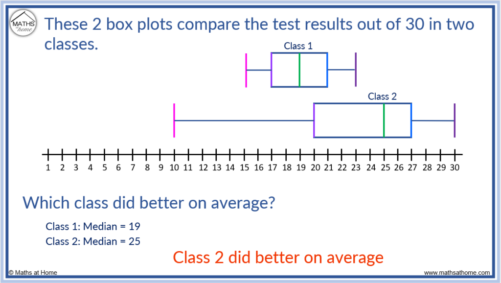
How to Compare the Median on a Box Plot
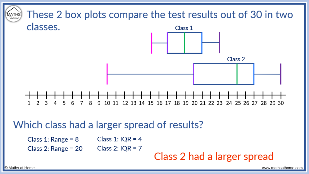
In this example, the 2 box plots compare the test results out of 30 in two classes.
The median is an indicator of an average.
To compare the averages using a box plot, compare the position of the medians. The median is indicated by the position of the line found inside the box portion of the box plot.
Class 1 has a median of 19 and class 2 has a median of 25. Therefore class 2 did better on average as they have a larger median.
Here is an example of comparing the averages of vertical boxplots.
To find which driver delivered the most parcels on average, we compare the medians.
Driver 2 has a higher median and so, delivered more parcels on average.

How to Compare the Spread using Box Plots
Both the range and interquartile range measure the spread of data. On a box plot, the range is indicated by the length of the plot from one whisker to the other. The interquartile range indicates the spread of the middle 50% of the data. On a box plot, the interquartile range is shown by the length of the box portion of the plot.
- Range = Length of the entire box plot
- IQR = Length of the box
For example, in the box plot below it can be seen that class 2 has a larger spread than class 1. This is because the range and interquartile ranges are larger.
Box plots allow us to make a quick and easy comparison of spread by comparing the lengths of the box plots.
Class two has a longer plot from whisker to whisker. Therefore it has a larger range. On a boxplot we can see this visually.
Class two has a longer box portion of the boxplot and so, it has a larger interquartile range. We can also see this visually.
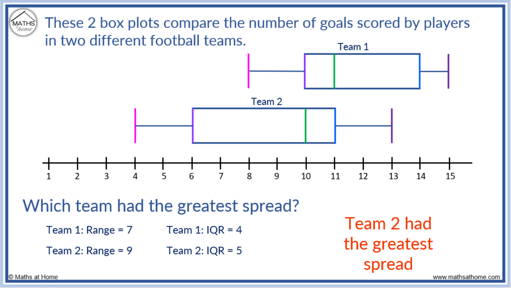
Here is another example of comparing the spread of data.
To compare the spread, compare the range (lengths of the boxplots) and interquartile range (lengths of the boxes).
Team 1 has a range of 7 compared to team 2 which has a range of 9.
Team 1 has an IQR of 4 and team 2 has an IQR of 5.
Team 2 has a larger range and therefore the whole data set is more spread. Team 2 also has a larger interquartile range and therefore has a greater spread in the middle 50% of the data.
Here is an example of a vertical boxplot.
A set of data is more consistent if it has less spread. To find the most consistent data, look for the data that has the smallest spread as indicated by the range and interquartile range.
Consistent means that the results are less spread out.
Because school 2 has the smaller range and interquartile range, it has the most consistent results.

Variability can be measured by the range and interquartile range of the data. The smaller the range, the less variability in the data. The smaller the interquartile range, the less variability in the middle 50% of the data.
Skewness of Box Plots
A box plot has positive skew if the median is nearer to the start of the plot and the first whisker is shorter than the last whisker. There is negative skew if the median is nearer to the end of the plot and the last whisker is shorter than the first whisker. There is no skew if the median is in the centre and the whiskers are of equal length.

A box plot may appear to only have one whisker if the minimum value is equal to that of the lower quartile or if the maximum value is equal to the upper quartile. In this instance, one whisker will be overlapping the edge of the box and will therefore not be visible.

It is possible for a box plot to contain no whiskers if the minimum value is equal to the lower quartile and the maximum value is equal to the upper quartile.
For example, in the simple data set [1, 2, 3] the minimum value and the lower quartile both equal 1 and the maximum value and the upper quartile both equal 3. The box plot will just look like a box with no whiskers. This is because the whiskers overlap with the box.

If a box plot appears to have no median line, the median is equal to either the lower or upper quartile. If the median is equal to the lower or upper quartile, it will overlap with the edges of the box so it cannot be seen.

Outliers on a Box Plot
An outlier is a data point that is significantly different to the rest of the data. On a box plot, outliers are always located outside the whiskers. Outliers are located either 1.5 times the interquartile range above the upper quartile (Q3+1.5×IQR) or 1.5 times the interquartile range below the lower quartile (Q1-1.5×IQR).
For example, identify outliers in the list of data [4, 17, 18, 19, 19, 20, 20, 21, 21, 22, 30].
To identify an outlier, first work out the interquartile range = Q3 – Q1. Then any values less than Q1-1.5IQR or larger than Q3+1.5IQR are outliers.
Outliers are removed from the data set and are not included in a five number summary.
Step 1. Calculate the IQR
There are 11 data values, so n = 11.
Q3 is located at the 3(n+1)/4 position. For n = 11, this is at the 9th position. Therefore Q3 = 21.
Q1 is located at the (n+1)/4 position. For n = 11, this is at the 3rd position. Therefore Q1 = 18.
Therefore IQR = 21 – 18. The interquartile range = 3.
Step 2. Work out the lower and upper bounds for outliers
The lower bound for identifying outliers is Q1-1.5IQR.
With Q1 = 18 and IQR = 3, the lower bound for outliers is 18-1.5×3. This equals 13.5.
The upper bound for identifying outliers is Q3+1.5IQR.
With Q3 = 21 and IQR = 3, the upper bound for outliers is 21+1.5×3. This equals 25.5.
Therefore any values less than 13.5 or larger than 25.5 are outliers.
Therefore the values of 4 and 30 are both outliers. They are removed from our data.

Outliers are not included in the 5 number summary. However, on a box plot, outliers can be represented by marking their position with a point. These points will be shown plotted at the location of the outlier value, which is outside of the whiskers on the box plot.
In this example, we can see points plotted at 4 and 30 respectively.